

Red wallpaper
- Features of the use of red wallpaper in the design of the walls
- How to choose harmonious shades?
- Using wallpapers with red flowers
- Apply red wallpaper in the bedroom
- The use of red wallpaper in the nursery
- The transformation of the kitchen
- Red walls in the living room interior
- Rating of the best wallpaper manufacturers
- Stock footage
The colors used to decorate the walls strongly affect not only the emotional state, but also on human health. That is why red wallpaper is rarely used in the interior, because it is a very bright shade, it is too saturated, it is impossible to create a relaxing environment with its help. But if you follow certain rules for the use of red wallpaper, then you can still create an expressive accent that will become the dignity of any interior. We will talk about how to correctly apply red wallpapers in our article, we will figure out what it is better to combine and combine with them.
to contents ↑Features of the use of red wallpaper in the design of the walls
Before deciding how to properly use red wallpaper as wall coverings, you need to find out what shades are better to give preference to when designing a particular room in the house.
On sale you can find wallpapers of many shades of red, each of which allows you to implement certain effects in space:
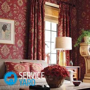
- Tones close to burgundy or wine palette. More often they are used to decorate living rooms, because in other rooms they look rather gloomy. In spacious rooms with huge windows and good natural light, such colors can convey all the subtleties of romanticism and classics, due to which the interior looks luxurious. The old decor is emphasized by red canvases with a gold pattern.
- Poppy tones. They can be used for interior design, which are designed for outdoor activities - it can be play areas in children's rooms or separate sections of walls in the living room. The main thing here is not to overdo it with too bright tones, it is better to use them as inserts against a background of more delicate calm colors.
- Pale red hues. Such wallpapers do not overload the interior, but also do not look too boring. This type of design can be diluted with catchy textile accents.
Red wall paintings are used to highlight specific functional areas or create accents. For example, you can use the living room to divide them into two zones - for receiving guests and relaxing, and the kitchen - for the dining and working areas, the children's room - in the area for study, games, sleep.
Important! When deciding to divide the space by creating smooth transitions between the red shades, it is necessary to ensure that such a palette is necessarily diluted with beige, white or gray inserts that muffle the oppressive bright design.
With the help of such wallpapers you can not only create a spectacular and lively atmosphere, but also achieve other interesting effects. If you apply this shade correctly, you can tune into a romantic setting or recharge with vivacity, internal energy. In addition, red shades are considered truly festive, that is, the room due to them will look solemn, fun.
to contents ↑How to choose harmonious shades?
As we have already specified, red wallpapers in the interior must be diluted with tones from another palette.But given that such canvases can be both gloomy and bright, sometimes even light, it is worth noting that not all shades will look harmoniously against the background of selected wallpapers.
The following combinations of shades in the red interior can be called optimal:
- The use of tones close to the red palette - peach, pink, burgundy. Such a design may turn out to be too bright, which is why it is imperative to take into account such nuances when decorating a room.
- Making furniture or walls in natural shades - yellow, blue, snow-white. Due to this method, you can bring the design closer to a more natural one, but the red tones against the general background will look brighter.
- Brown and black tones overshadow the environment, which is why it is better to use them in a limited amount. If your interior looks too oppressive and dark, then you can choose furniture in pastel colors or add light inserts on the walls.
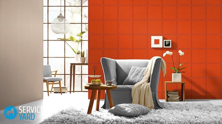
- Bright shades, like orange and green, do not combine with dark red or light wallpaper, so it is better to entrust their professionals with their harmonious combination.
- Red color is best diluted with warm and gentle pastel colors, for example, beige, white, gray, light brown, terracotta or blue.
Important! Excessive use in the interior of red tones will visually decorate the space. But due to them, the room will look too crowded, and the lighting is dim, so it is better to compensate for such effects.
The best option is a room with red wallpaper on only one or two walls. Red tones look great when they do not continue on adjacent walls, but move smoothly to the ceiling surface. Using this principle allows you to separate a specific area, reduce the height of the ceilings.
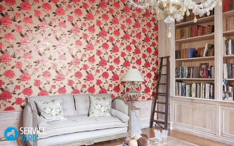
Using wallpapers with red flowers
Floristic themes will always be popular. Wallpaper with red flowers is the trend of this season. On the walls, bouquets of real wildflowers with rich green leaves look simply gorgeous.
The most popular are white and light canvases with the image of bright red flowers. In particular, these are roses and poppies. Large buds are more suitable for spacious rooms with a minimum number of pieces of furniture, but small flowers - for small rooms.
Important! The fewer elements in the apartment, the larger should be the patterns or drawings on the wallpaper.
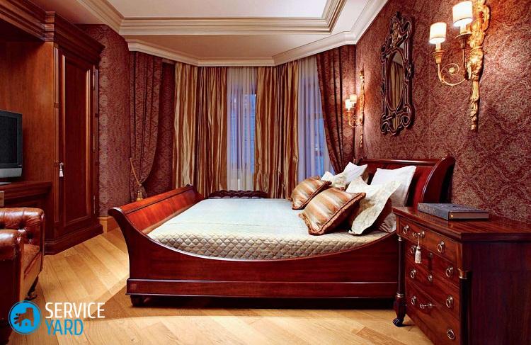
Apply red wallpaper in the bedroom
It was not by chance that we decided to first consider the use of red wallpaper in the bedroom interior, because many often make the mistake of thinking that this shade is perfect for this room. But this is a huge mistake, because too bright red walls do not emphasize a passionate and romantic atmosphere, but rather become a cause of aggression and fatigue. Therefore, it is better to use red-white wallpapers or their combination with pink or beige color. It is quite acceptable to use wallpaper with red patterns on a light calm background.
Important! In a romantic bedroom interior, such wallpapers can play the role of bright accents, which is why it is better to glue them on ledges or in niches, decorate them with partitions or other decorative designs.
To achieve a restraining effect, in the red bedroom it is recommended to give preference to light furniture. For example, in modern styles it is better to use furniture with a glossy snow-white surface. Older designs will perfectly complement tables, cabinets and other elements of wood in dark and light colors.
The use of red wallpaper in the nursery
A children's room with red wallpaper is completely unsuitable for young children. The fact is that at such an age, too bright effects only annoy the kids. But older children perceive these colors very differently - for them they are more favorable, for example, if you combine red with other vibrant tones, then you can develop creative abilities in the child.Therefore, such wallpaper often decorate the game area.
Important! Remember that in a children's room, any shade affects the formation of character, which means that in this case red is only useful, it helps to raise an energetic, active child.
Such shades in the sleeping area are unacceptable, but here you can safely use a muted red tone, combining it horizontally with a wallpaper of a calm color. Such smooth transitions allow the child to fully understand the world around him.
The transformation of the kitchen
Even in the kitchen today, you can use red wallpaper on the walls. But considering that too saturated tones can overshadow the working or dining area, it is better to combine dark red wallpaper with light furniture. The red palette is in harmony with beige and white, as well as metal inserts on kitchen units. In such a space, some walls and floors are best designed with balanced shades.
As for the plots for placing red wallpaper, it is more appropriate to decorate the walls near the dining table. Here you can use ordinary plain canvases with thematic drawings, murals with red flowers, a glass of wine, fruit or abstract motifs.
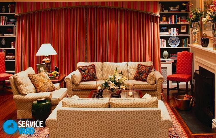
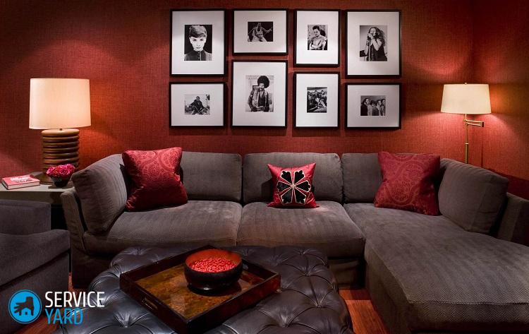
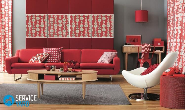
Red walls in the living room interior
In the living room it is incredibly important to try to maintain a balance between calm and bright colors. The versatility of the living room interior is in a harmonious combination of colors, because here each zone has its own specific purpose. For example, you can make a wall with paintings or a TV neutral, because black and red wallpapers will only distract you from viewing. With such canvases it is better to decorate the walls behind the sofa, game or balcony area.
Important! The room should not be abused with rich red wallpapers, because such an atmosphere will get bored over time, and then it will be extremely difficult to choose neutral harmonious shades. Therefore, it is recommended to plan ahead what exactly you expect from the future design in order to achieve the desired effect.
Bright red colors have always been considered a sign of modernity and dynamism, vintage design themes were more concentrated around muted tones. In the living room, you can use red-gold patterned wallpaper to decorate either the entire wall or to highlight a specific fragment. Such inserts can be distinguished mirrors, shelves, photo frames, paintings, lamps, television.
Rating of the best wallpaper manufacturers
Before you go to the store for wallpaper, check out the rating of the best manufacturers, according to users, by country.
The top three brands:
- America. The companies of this country occupy leading positions. They produce the best products supplied to the world and domestic market. These brands include: Chesapeake, York, Fresco, DID, Ronald Redding, Next wall.
- England. The materials of the English manufacturers are in demand due to the exquisite modern and classic design, as well as the ecological composition. These brands include: Sanderson, Arthouse, Designs, Chelsea, Harlequin, Cole Son, Prestigious Textiles.
- Belgium. The features of this national production include the creation of seamless coatings of paper, non-woven and textile, the use of special technology for creating designer vinyl wallpapers, which in their structure involve coloring. The best brands of this country include: Khroma, Omexco, Arte, Grandeco, Ideco, Calcutta.
Stock footage
Now you know how to use bright red canvases, wallpaper white with red flowers, other variations on the walls in certain rooms in the house. And that means - you definitely will not make mistakes when choosing them and independently decorating a room with such unusual, but beautiful, stylish, extraordinary wallpapers.
- How to choose a vacuum cleaner taking into account the characteristics of the house and coatings?
- What to look for when choosing a water delivery
- How to quickly create comfort at home - tips for housewives
- How to choose the perfect TV - useful tips
- What to look for when choosing blinds
- What should be running shoes?
- What useful things can you buy in a hardware store
- Iphone 11 pro max review
- Than iPhone is better than Android smartphones
 (No ratings yet)