

The color of the walls in the living room

The living room is one of the important rooms in the house. This name is due to the presence of a large area. Here, many spend a lot of time with family, friends, or just read books in a relaxed atmosphere. In the living room, everyone should feel as comfortable and comfortable as possible. That is why it is very important to choose not only furniture and additional accessories, but also the color of the walls in the living room. With the help of color, you can advantageously beat a room with a different layout. Today we will talk about this topic, consider various color options for a bedroom of different sizes.
to contents ↑The color of the walls in the hall. Design Features
When choosing walls in the living room, the following points should be considered:
- The size of the bedroom.
- Side of the horizon.
- The color of the furniture.
- Wishes of all family members.
When choosing the tone of the walls, you need to start first of all from the area of the room. Colors can be both warm and cold:
- Warm colors include colors such as red, yellow, and orange.
- Cold considered red, yellow and orange.
- It happens that one color can be both cold and warm, for example, different shades of green.
to contents ↑Important! Color schemes of the walls in the interior should be agreed with all residents of the house. This is a very important factor, since the living room should carry a cozy atmosphere, creating a sense of home. Tinting should be liked by everyone, in no case annoying.
We set goals correctly and take planning into account
Some do not even realize that the color of the walls can play a big role in the perception of any space. So, with proper design, you can even make a large living room from a small bedroom with an unsuccessful layout. We present to your attention several basic rules that guide famous world designers:
- A cold palette can visually increase the space of a room, and a warm one makes it soulful and compact. Often you can find a living room decorated in green or blue. People purposefully or intuitively choose a palette that will help you relax after hard workdays.
- If your bedroom is facing south, then opt for cold flowers so that you are much more pleasant and fresh on a hot day.
- For a room on the north side, it is advisable to choose warm shades of the walls. Here, everything is decided by the psychology of perception, because the sensation of warmth or cold can occur not only by skin receptors, but also by vision.
- If the location of the bedroom has a western or eastern direction, then here you need to correctly create a certain range. For the living room with the western side, cold colors should be used, since with the setting sun they will become saturated bright. For the eastern side, pastel shades are more suitable, so that in the sunlight the room does not look very screaming.
- The ceiling can be visually raised, painting it several tones lighter than the tone of the walls of the living room. But a darker shade will make the high ceiling visually lower.
- It is important to consider the perception of the color of the walls under the influence of daylight and artificial light. It is in the evenings that the family spends most of the time. Some color schemes may have different perceptions in daylight and when the lamp is on.
- If the room is irregular in shape, for example, long and narrow, then you need to competently beat the situation by bringing the room parameters closer to the standard size. So, for example, if you paint the end walls of the living room in lighter cool tones than long walls, you can make the room visually square.
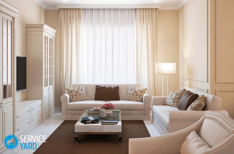
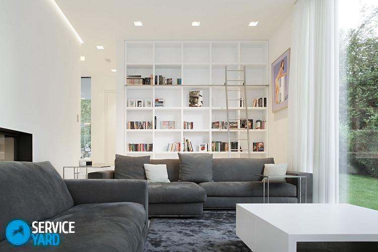
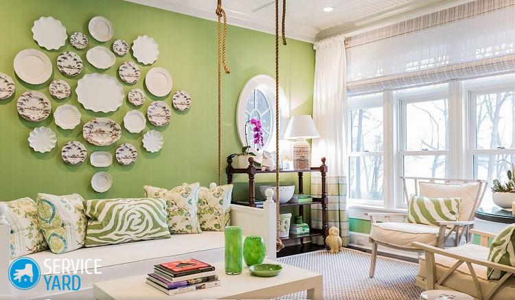
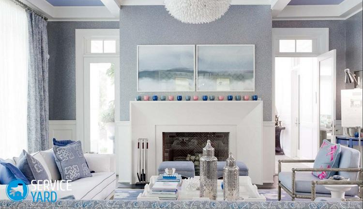
The color of the walls in the room
When decorating the living room, it is extremely important to consider the psychological perception of color. Different design can affect a person in different ways, relaxing him or exciting. Let's understand together what we can get when using one or another color of the walls in the living room:
- White - makes the room spacious, but it needs to be combined with another palette so that the room is not boring and uncomfortable.
- Yellow is the color of the sun, which strengthens the nervous system and gives strength.
- Red - activates, revitalizes, but in excess it acts excitingly.
- Orange - warms, restores, awakens vitality.
- Violet - calms nerves, inspires, promotes mental work.
- Green - sets up for creativity and relaxation.
- Blue - acts soothingly, increases concentration.
Walls of different colors in the interior
If you decide to correctly design the interior of the living room, then it will not hurt you to know about the combination of colors and their shades. Depending on the color palette of the room, your mood may also change. For this reason, it is so important to be able to combine colors with each other and choose the most suitable option.
Four color combinations:
- Monochromatic. It is based on combining several shades of the same color using different textures and patterns.
- Contrast It implies the use of a bright palette - here red, orange and lilac are used.
- Neutral. Indicates the use of the most muted colors and their shades (pastel and gray).
- Harmonious. It is built on the basis of two colors from one spectrum (green and blue).
Important! In order not to oversaturate the room, an important rule should be used as a rule: you cannot use more than five colors in one room. A combination of different shades of one palette is allowed, which should be harmoniously combined with each other. Ideally, there should generally be a maximum of 3 colors.
Color combinations in the interior:
- When using beige, contrasting details should be avoided. The selection of furniture and accessories should be as close as possible to the beige tone. Pastel color goes well with chocolate and coffee shades.
- Gray on the walls is not used very often. It harmonizes well with black, orange, pink or light green.
- Neutral green color goes well with brown, white and yellow.
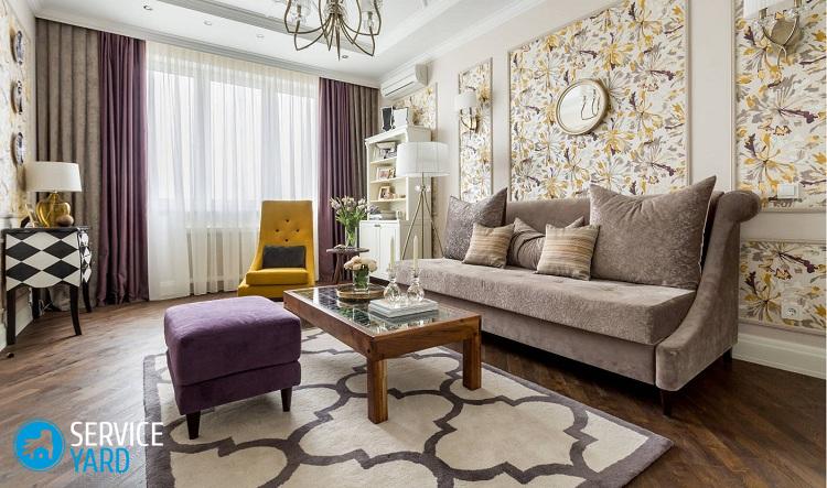
- Lilac and light violet colors can be combined with beige, brown and muted yellow shades.
- With red, it is beneficial to use white, brown, light gray, gold and beige color schemes.
to contents ↑Important! It is not necessary to design the living room exclusively in red so that it does not carry an aggressive character.
Stock footage
As you already understood, colors play an important role in the visualization of the room. With the right palette, you can increase or decrease the room, as well as raise the low ceiling. Which wall color to choose for the living room is up to you to decide, as this is your home and family hearth. Let peace and harmony reign in your living room!
- How to choose a vacuum cleaner taking into account the characteristics of the house and coatings?
- What to look for when choosing a water delivery
- How to quickly create comfort at home - tips for housewives
- How to choose the perfect TV - useful tips
- What to look for when choosing blinds
- What should be running shoes?
- What useful things can you buy in a hardware store
- Iphone 11 pro max review
- Than iPhone is better than Android smartphones
 (No ratings yet)